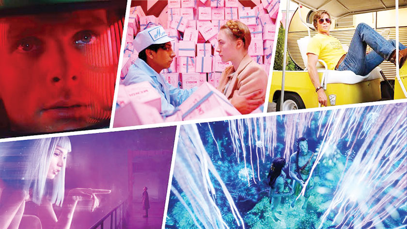
Colourful cinema palettes directly affect an audience’s experience of a film....
COVER STORY
Black and white cinematography dominated the first decades of filmmaking. It wasn’t until the 1950s that colour cinematography replaced black and white as the predominant style.
With the explosion of colour in film, a new approach to the movie colour palette had to be created. The artists who’d used light and shadow to tell stories now had far more tools at their disposal.
It was what you might call a game changer.
How can colour tell a story?
When starting out on your short or feature film project (or, really, any type of film or video project), there are obviously many early decisions to be made. You’re thinking about your story. You’re thinking about your script. The budget, locations, and actors.
You start working on your storyboards, planning your shot lists, and begin an overall discussion of your compositional strategies. Another facet of your production that needs to be considered before the first frame is shot — your project’s colour scheme.
Colour in filmmaking is a huge part of the overall effect of everything we see in the frame. When you think back to some of your favourite films, you’ll likely notice that colour plays a huge part in your cinematic memories.
It is basically the foundation for how we communicate in the language of film. It influences decisions made by almost everyone involved in a production as they develop motifs, themes, and characters. These decisions dictate how colours work together in symmetry or in contrast to develop the looks that bring a film’s narrative cinematography to life.
From eliciting psychological reactions and drawing focus to significant details to setting the tone of the movie, representing character traits, and showing changes or arcs in the story, remember that there are three main components of colour at play:
hue – the colour itself;
saturation – intensity of the colour; and
brightness – the darkness or lightness of a colour.
Understanding colour theory
In filmmaking, colour theory refers to the notion that certain hues on the colour wheel combine to create particular visual effects. Cool, unsaturated colours may be used to create an atmosphere of gloom, rich greens and earth tones can create feelings of balance and symbiosis, and vibrant colours on the warmer end of the spectrum can bring energy and intensity to a film.
Many viewers will have predictably similar reactions to certain colours. However, the colours you choose for any given scene reflect the emotion you’re trying to convey.
Here are some accepted basic emotional properties for different colours often found in cinema.
Red: Aggression, violence, and anger.
Orange: A sense of warning and caution.
Yellow: A sense of danger, judgement, and assertiveness.
Green: New life, new beginnings, and survival.
Blue: Faithfulness, loyalty, and childlike wonder.
Purple: A sense of ambiguity and extravagance.
Pink: Associated with romance, love, and passion.
Colour theory norms should be understood by filmmakers, but never seen as a limitation. It is very much open to both interpretation and intentional divergence, which explains how filmmakers are able to create complex emotions by using, changing, and challenging the above.

The importance of a colour palette
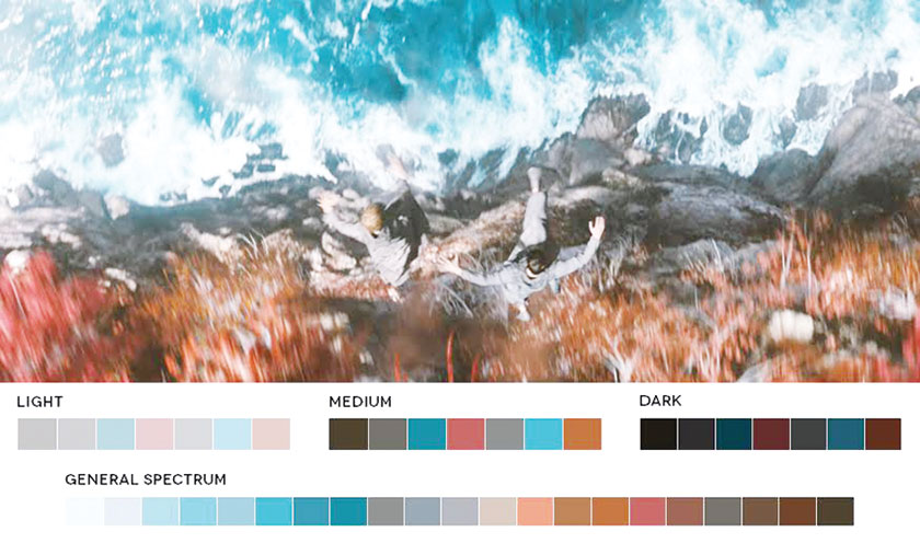
Along with a grasp of colour theory, another important tool to use when deciding your film’s colour schemes are your film’s colour palettes and barcodes. These are snapshot looks that offer greater insight into a film’s overall use of colour. You frequently see these online, and they’re a very cool way to see the unique — and often surprisingly focused — colour schemes of your favorite films.

Choosing your colour schemes
Determining the theme, conflict, and message of your story will aid in deciding on a colour scheme. Here are some helpful questions to ask yourself as you begin making your colour decisions:
Who are my main characters and what characteristics define them?
What’s the essential conflict of my story?
What are the themes of my story?
What message (if any) would I like to get across?
There are no right or wrong answers here, and your ideas might change as production advances. Nonetheless, using the above theories and techniques to form an early idea of the colours, themes, and characteristics you’d like to develop is a great way to start.
When filming begins, you’ll find many tools and techniques that can help you create and manipulate colour in your on-set compositions. For instance, working in camera with colour temperature and monitor calibration, while also exploring your vast lighting and gel options. Additionally, things will go smoother if you understand the basics of camera colour science and the value of on-set tools like colour charts.
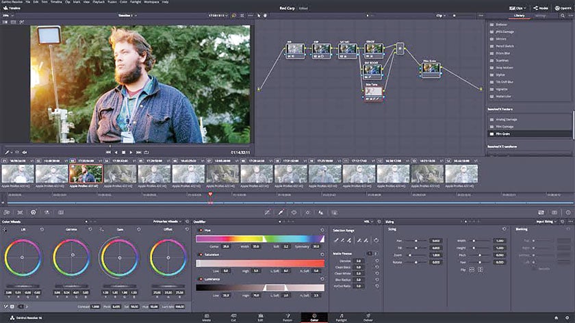
Adding colour in post-production grading
And finally, while you’re very likely to find a ton of great (and sometimes not so great) pieces of advice on how to create, add, or change your film’s colours in post-production, colour grading should really only be thought of as a way to touch up the colour schemes you’ve been developing since pre-production. The power and all-around awesomeness of colour editing platforms doesn’t make them a cure-all for poor planning.
Colourful cinema palettes directly affect an audience’s experience of a film. Colour creates ambiance, amplifies emotion, and heightens symbolism. This is why directors, cinematographers, and production designers choose their color palettes in preproduction, long before they begin filming.
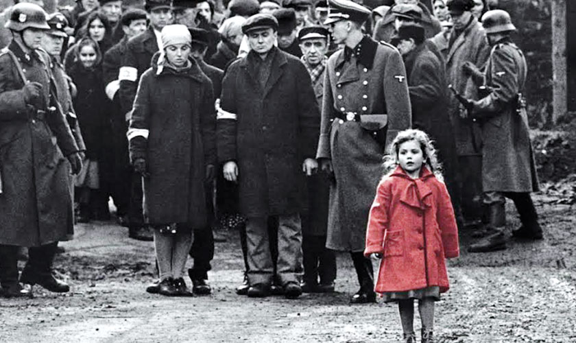
Use colour discordance to direct audience attention. Colour discordance is when one colour clashes with the rest of a picture, drawing attention to the object that stands out. A particularly heightened version of the colour discordance effect is the inclusion of one or two coloured objects within a film that is otherwise monochromatic. Steven Spielberg famously used discordant color in Schindler’s List, including one girl in a red coat within a film that is otherwise in black and white.
Use complementary colour schemes to create striking images. Complementary colours are colour pairs that fall exactly opposite each other on the colour wheel — one primary colour and one secondary colour. Orange and blue are complementary, as are yellow and purple. Complementary colours produce some of the most satisfying colour harmonies in filmmaking, bringing a satisfying contrast without creating discordance. Red and green, in the instance of Amelie, both pop more in the presence of their complementary color.
Use analogous colour schemes to connote harmony. Analogous colours fall next to each other on the colour wheel, like red and orange or green and blue. Depending on how they’re used, analogous shades can create serenity or an oppressive sense of uniformity. Children of Men’s analogous color scheme seemed to match the dangerous state of its world in which no more children were being born.
Use triadic colour schemes for satisfying images. A triadic colour scheme involves selecting three different colours and emphasising them above all others. Many superhero movies use a high-contrast triadic film colour palette, although the technique was more popular in the early days of Technicolor filmmaking than it is today.
Hire a professional colourist. If your film budget allows it, a professional colourist can add colour consistency to your final product using the process of colour grading. Colour grading allows scenes filmed under different lighting conditions to maintain the same basic hues and shades.