WhatsApp's green colour 'angers' some users
Meta app's new display colour doesn't sit right with some people

WhatsApp, which was previously known for its blue theme, has now updated its display colour to green, an action which has made its users to have contradicting opinions.
No matter whether a change is minor or major, the Meta app’s new updates always cause a widespread stirring of conversations.
However, regarding the new display colour update, Meta-owned WhatsApp, aims to deliver a "modern, new experience" through these changes and “make it more accessible as well as easier to use."
The company said in a statement that they had changed how WhatsApp “looks and feels, including spacing, colours, icons and more.”
The new WhatsApp update is visible to both iOS and Android users, with the latter seeing a change in shade from the previous green.
On the other hand, iPhones, which used to have a blue colour scheme in WhatsApp, will see that every inch of display layout from the status bar to the chat-list window has transformed the recent design change.
Additionally, even the links shared within the app are now visible in green instead of blue.
Moreover, WhatsApp has carried out other updates intended to enhance its user experience separately from the colour change.
-
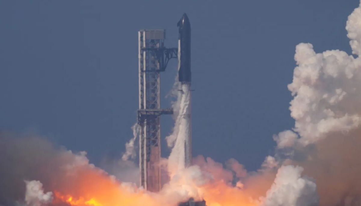 SpaceX IPO buzz intensifies as strategists debate $2 trillion valuation
 -
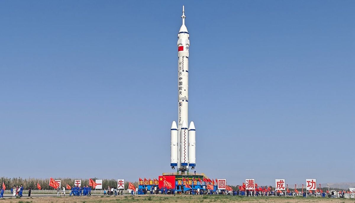 China to launch Shenzhou 23 crew to Tiangong space station
 -
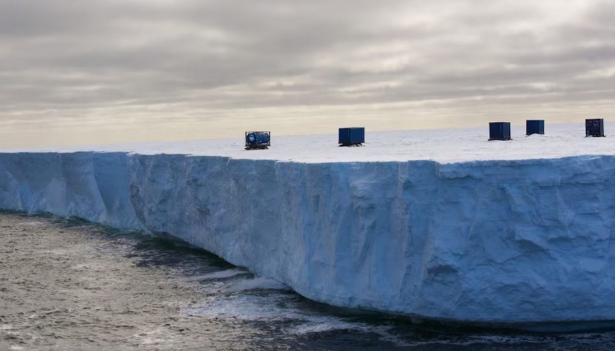 Antarctic blizzard sends fuel containers floating on an iceberg: Here’s why
 -
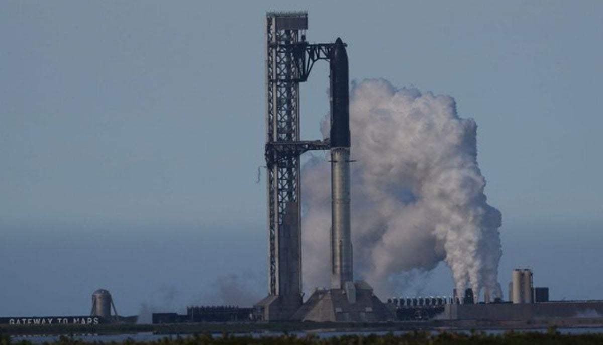
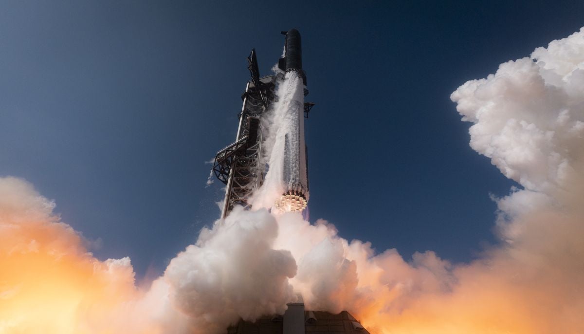 SpaceX Starship test flight succeeds despite engine failures
 -
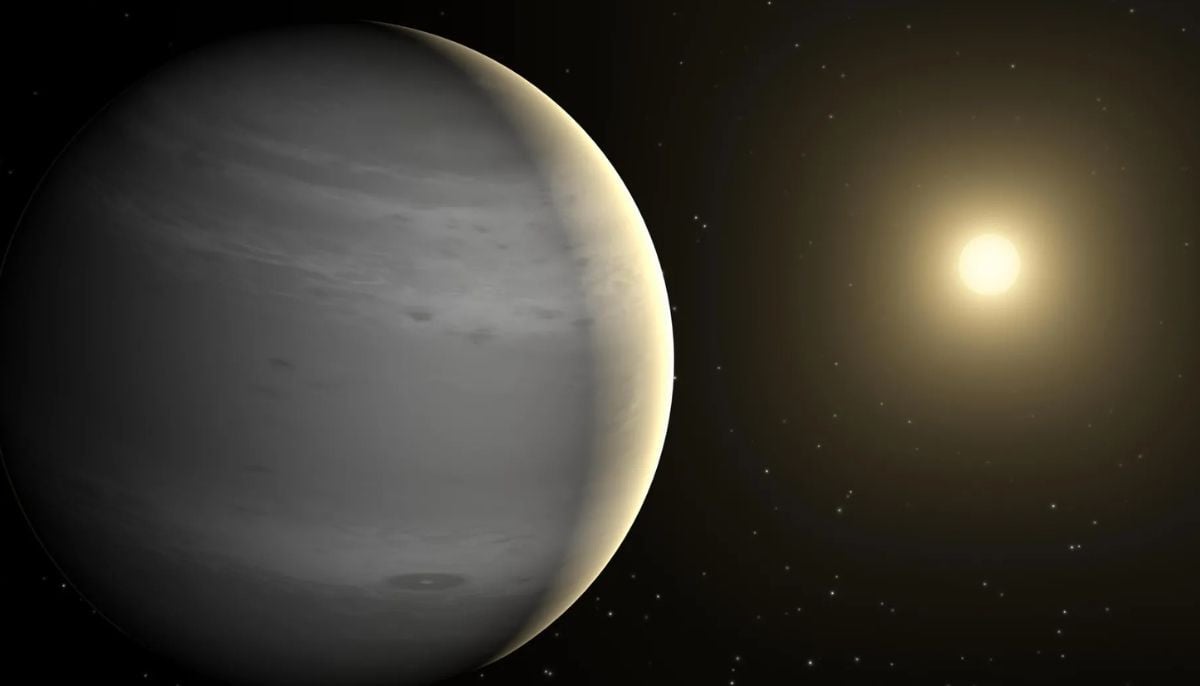 Is this Earth 2.0? NASA’s James Webb telescope spots ‘rare’ giant exoplanet
 -
 SpaceX Starship launch delayed again: Here’s what went wrong
 -
 Why do scientists think Neptune’s moon Nereid survived violent cosmic collision?
 -
 NASA set to unveil major Moon Base strategy and mission update
-
 SpaceX’s upgraded Starship V3 ready for high-stakes test flight: Where to watch live
 -
Scientists hatch live chickens from 3D-printed eggshells: Could artificial wombs be next?
-
SpaceX: Starship V3 all set for debut launch ahead of IPO
-
Four alien species recovered from crashed UFOs, Ex-CIA researcher claims


