This week You! takes a look at how one can incorporate the different shades of green in their home décor and interior design…
When it comes to planning home décor and interiors, one of the most critical decisions is choosing the right colour scheme. One wrong decision, and there you go; back to square one. Colour can infuse the mind to create moods or feelings. If we can understand colour better, we can create rooms that not only look right, but feel right as well. With that being said, it only makes sense to carefully scrutinise all the options and think through them instead of taking chances and awaiting the final results.
Green is a versatile hue that represents growth, renewal, prosperity and regeneration. So, it would only seem ideal to surround ourselves with this luscious colour. It’s no coincidence the majority of urban/city dwellers escape to the country on weekends and on holidays – it’s to re-connect with nature, take in the green on a subconscious level to restore and rejuvenate. However, green can be a tricky colour to work with. It could either be too much or just not enough, or not even the right shade that you want. But fret not, we have got you covered! Here is a style guide for you to decide what works for your home the best…
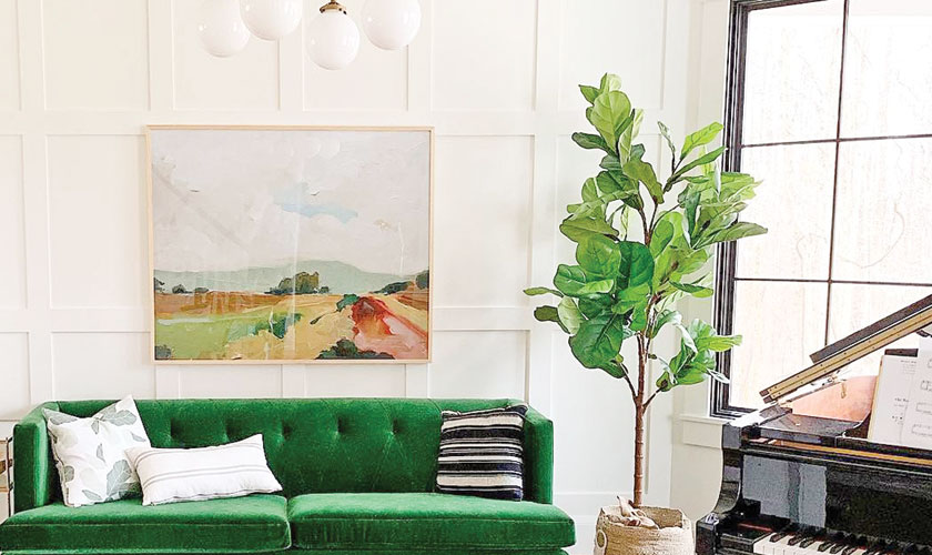
The living bloom
The living room is probably the most integral part of one’s home and tends to captures every visitor’s first sight. And you know what they say, ‘first impressions are the last impression’ so you surely want to make this right. A green living room, with little tints of brown and a white ceiling, is going to give your living room a vibrant look. We recommend going for dark green shades like olive green since they stand out and go well with white. Combine it with hardwood flooring, the perfect couch set, and you are good to go.
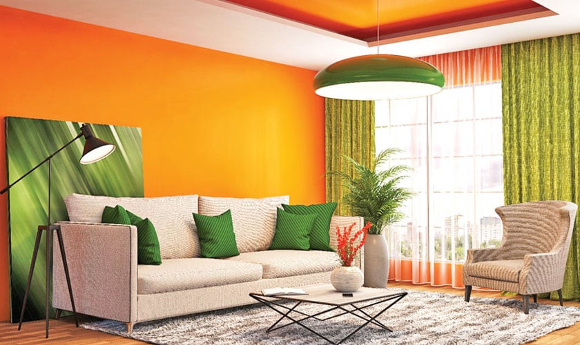
Another great way to incorporate green in your living room is to make it the focal point of the room. For instance you can keep an emerald green sofa in the room with the rest of the room in neutral colours. A similar but cheaper option is also some emerald-coloured cushion covers on neutral upholstery. This way the room has a touch of luxury and it also doesn’t overdo it.
Moreover, when it comes to complementing colours, in the design world, you are taught not to put blue and green together. However, many designers believe that it all depends on the tone of green and blue you use. It would be best to use the same tonal colour group as the green you are using and you can experiment with the most unexpected and effective colour combinations. For instance, if you choose a mint green colour scheme, stick to white or lighter hues of blue.
The fine dining
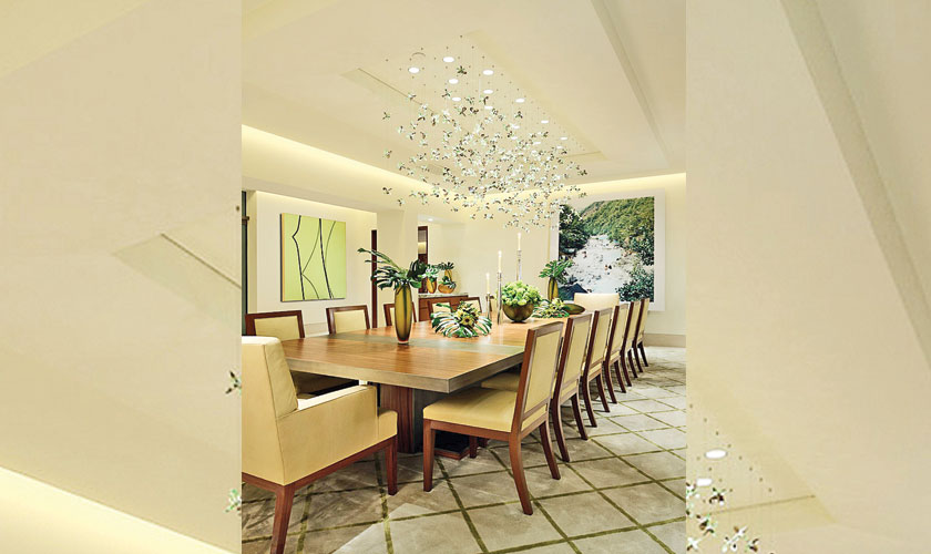
For most desi households, dining rooms are utilised on an occasional basis. Whether it’s when guests are coming in or those lazy Sunday afternoons when everyone is home to break bread together. In any case, your dining rooms allow you some room for experimentation. And if your room has a lot of natural light, it makes it all the more exciting. For colour combinations, you can opt for classic combinations such as with red (which you can take into the pink tones) or such as purple or orange. Go with any combination you like, the key is to use colours that are in the same tonal colour group (i.e. yellow or blue based) otherwise you are likely to experience a jarring effect making it difficult to live with over time. If you do decide to team with some red, just remember it will make the green look greener and the red redder. So if you are using purple it will bring out the red more prominently.
Our advice is to add a touch of green through accessories, whether it’s through paintings, potted plants, linen or even crockery. Dark wood also works quite well with olive green upholstery.
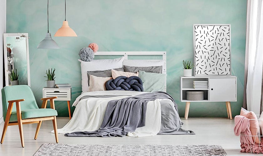
Unwind in elegance
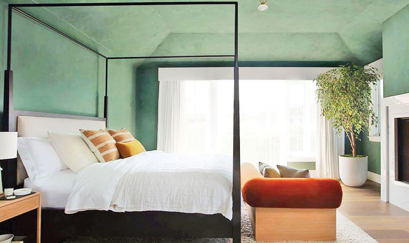
Your bedroom is the space in your room where you can truly be yourself and unwind after a long day. So, it only serves right to have nature’s finest colour in this room. You can paint one of the walls with a rich shade of green with yellow undertones as it will emit a warm glow. You can also be inventive and use vintage fabric as panels. Moreover, accessories such as rugs, light fixtures and artwork can also add some pops of green.
Green and white is classic and crisp. So is green and black. Either way, mixing it with a neutral on either side of the spectrum will make your design elegant and timeless. Or, you can mix all three for a modern, energetic look. Black wood against white backdrop and green linen is an easy way to have all three together.
Sprinkle of green
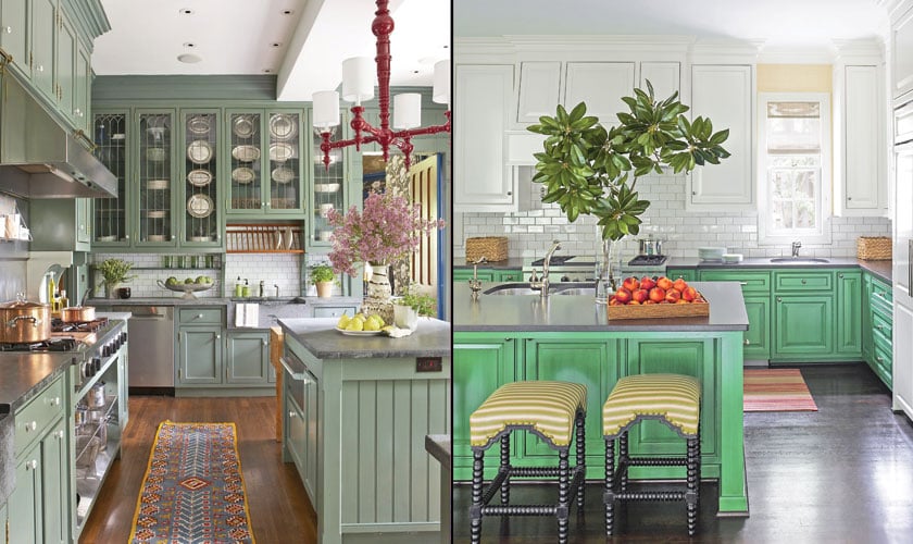
Kitchens are all about food and love and it should represent just that. The vibe should be warm and welcoming, and when you are cooking up a storm, it should be calming as well. From chartreuse to avocado to teal, green is a trending colour in today’s kitchen design. Whether you decide to go bold with bright green or subtle with a sage hue, colourful cabinets are one of the latest kitchen trends. Green cabinets create a harmonious look since the shade matches nicely with the browns, greys and taupes in today’s hardwood or vinyl plank flooring and neutral-toned walls and countertops. A wall or corner of the room is one of the best places in your kitchen to introduce green. This use of colour lends dimension and interest to a room without overwhelming it – and it is also very much in vogue in today’s kitchen designs. Moreover, a bright jungle green accent wall or alcove will really stand out against white or cream walls and cabinets, whereas paler shades are more relaxing. You can also choose similar shades for other elements in the room, such as seating, lighting fixtures, bowls or artwork.
We often don’t put in a lot of thought in our bathrooms. Ironically, that also happens to be the place where we end up doing most of our thinking. Your bathroom is a place of solitude where you can get ready for the day, decompress from a stressful day at work and relax. It’s a place where you can be alone, relax in the tub, take a warm soothing shower, and completely unwind. With the right renovation, you can create a spa-like atmosphere.
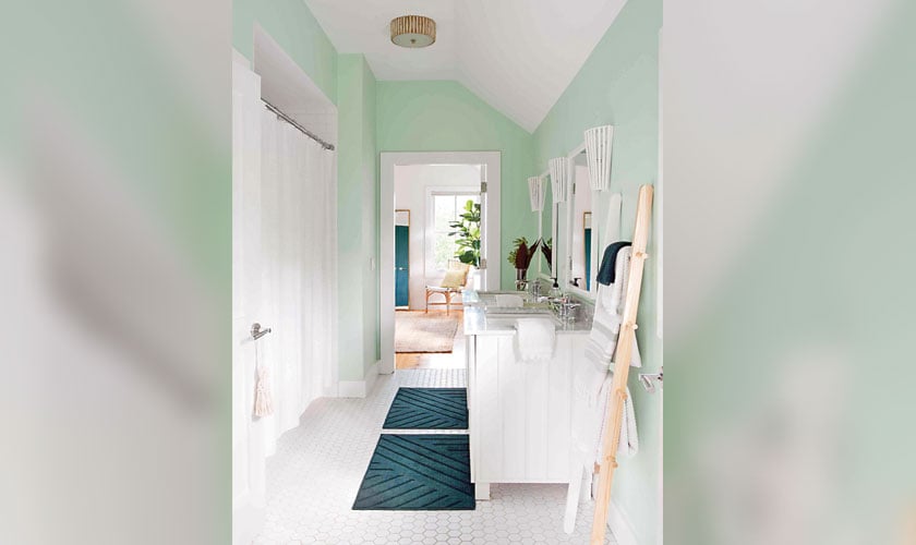
Light colours tend to open up a space; hence mint green paired with white can do wonders for this room. More subtle than teal and warmer than sage, think of mint green as a peppy, happy medium between those two shades. With mint green walls and white cabinetry and accessories, dressing up in the morning may just become quite relaxing. If you are looking for a luxurious touch, dark green and dark wood is the way to go. Add dark wooden cabinets along with white for the tiles on a dark green backdrop for a defined look.
SHADES OF GREEN
The colour green is strongly associated with nature and people; hence it is often described as natural, fresh, and restful. However, there are various shades of green and each represents a different emotion and feeling.
Bright green: Rebirth, spring, Mint green: Health and good luck,
Emerald green: Luxury and refined, Olive green: Tranquillity, earthiness,
elegance, Dark green: Fertility, money, drive, Yellowish green: Brightness and chirpiness, Aqua: Cleanliness, freshness, water, Pale green: Peace