Print Story
X

On August 4, the government of Pakistan issued a new political map of the Islamic Republic that now includes Indian-held Kashmir, Sir Creek and Junagadh and Manavadar. A map in its nature is a line that encircles a piece of land, thus separating it from other territories.
Maps, like flags and other national symbols, are believed to be eternal truths (wars are fought to defend boundaries). But many nations have had different maps at different stages of their existence. The Indian map was altered in 1947; East Timor was carved out from Indonesia; and Israel’s map was updated/expanded after every war with neighbouring Arab countries. Spain and UK may have to modify their maps in the near future if Catalonia and Scotland become independent states.
In a sense, countries are like humans, acquiring more volume at one point, and shedding extra calories at another.
Whatever the scale, a map is a means of locking that precious possession in the public arena. It is considered as something sacred, and the borders are guarded with one’s life. The tableau that takes place every afternoon at Wagha-Attari border illustrates the passion for protecting the motherland.
For this and other reasons, maps have been a favourite motif for artists. Some have dealt with them in formal language, others have investigated their political implications, while still others have sought to subvert their power and impact.
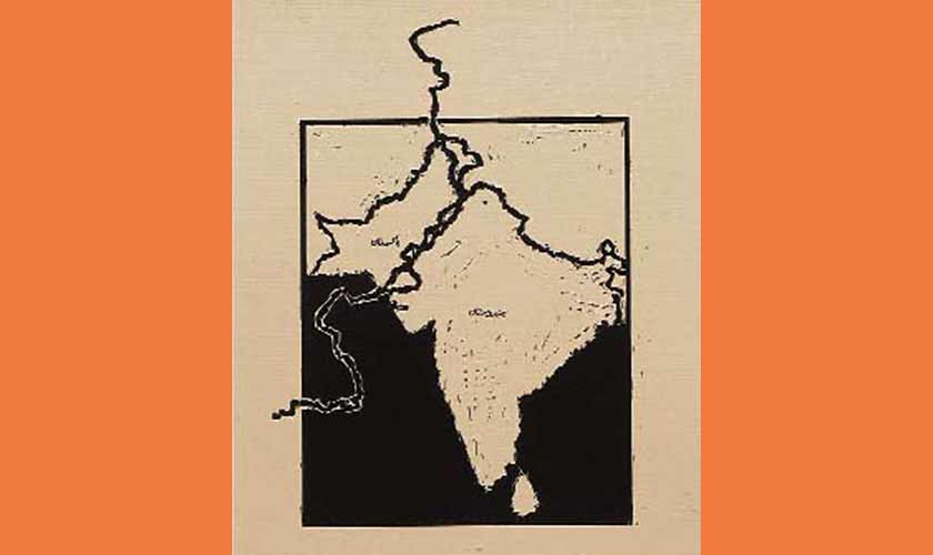
To a creative person, moving away from her homeland, the map is a symbol of self and displacement. The most significant name from our art world that comes to mind is that of Zarina who lived in the United States of America but invoked her place of origin in her art. Her works may appear nostalgic but in reality address a political situation. For instance, Dividing Line (2001) and Atlas of My World IV (2001); in which the line between India and Pakistan is the dominating mark, while areas on both sides are a muted texture; hence a paradox. The imaginary line isstrongly registered, whereasexisting detail is diffused.
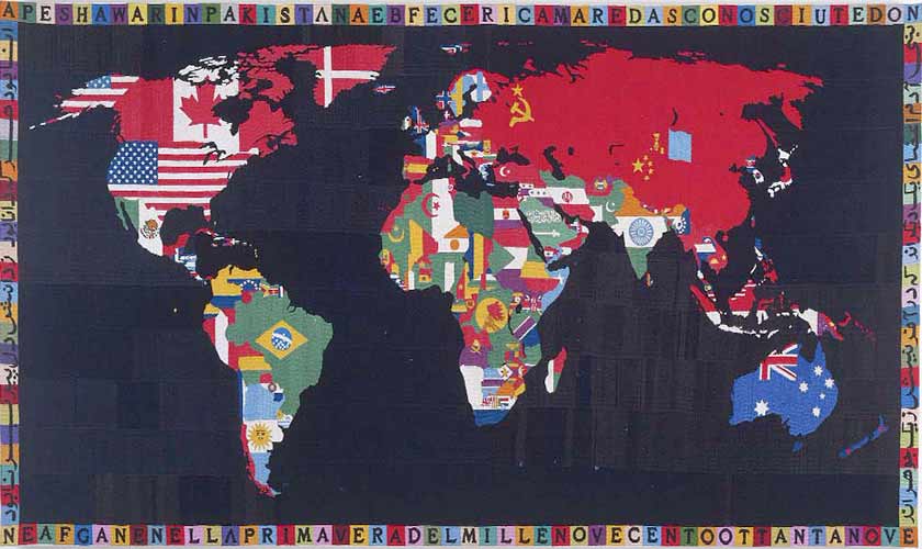
Italian artist Alighiero Boetti created A Map of the World, a series of world maps, of countries filled with patterns of their flags. “In the late 1960s, Boetti became interested in maps, drawing the outline of Palestine and the ‘occupied territories’ as a man-made shape which, once copied, could be labelled ‘art’”. In 1971, he visited Afghanistan and got fascinated by the embroidery, so his artworks were weaved by Afghan women using traditional methods and materials. The observation of Boetti, about map being a man-made entity, cannot be more true than for the borders between North African nations, or the boundary of Jordan; lines drawn as if on a board by Imperialist states men while dividing their occupied land.
An ordinary or aesthetic aspect of maps is witnessed in several map paintings of Jasper Johns (from the early 1960s), representing US territory with its states’ names. According to American art critic Leo Steinberg, this body of work had a more formal connotation than political significance. In his book, Other Criteria, Steinberg explains Johns’ preference for map, along with flag, numbers, letters, and target, for the flatness of these items. Jasper Johns wanted to reinforce two-dimensionality of a canvas by portraying two-dimensional images.
Not only national maps, but other maps are also picked by artists. London Tube map (originally drawn by Harry Beck in 1933) is appropriated by British artist Simon Patterson. In his The Great Bear (1992), he recreates the underground plan, but switches the names of stations with the names of famous personalities from history. So you don’t arrive at the ‘High Street Kensington’, but at ‘Arthur Schopenhauer’, and so forth.
In its essence, a map is a conceptual device with shades of power. All recorded human history is about recording maps. And the ways these are drawn have subtexts about worldviews.
In our atlases, we accept the world portrayed with North (America and Europe) on top and South (Latin America and Asia) at the bottom, not paying heed to the fact that the planet is a globe, thus not high or low. Uruguayan artist Joaquin Torres-Garcia challenged this hierarchy in his ink on paper Upside-down Map (1943), in which the South Pole is above and the equator at the base. And Chile is higher than the United States!
Regardless of whether maps are from the present or the past, they reveal more than mere land. One of the earliest found samples of cartography is the Bedolina Petroglyph from Valcamonica, Italy (1500 BCE), in which houses and livestock are incised on rocks. Abodes, animals and fields are carved in these primitive maps but interestingly the shape of a house, a rectangle with a triangle on its head, is similarto what is sketched by the kids of the 21st Century in their early years of schooling.
Various cultures, from Mesopotamian, Pre-Columbian American, Chinese, Japanese, Indian, Arab, Aboriginal Australian, Medieval Europe to Industrial nations and Colonial powers, have been producing maps of their territories and the rest of world which confirm their position and power. Every society has a different way or language to denote this, ranging from factual, selective, to imaginative or dreamlike (as of Aboriginal Australian) approaches. However, in each case, a ma-pmaker is an artist no matter if his/her name is not recorded or recognized, because the act of cartography is an attempt to convert a physical reality into an abstract idea/substitute.
Leonardo da Vinci made the map of Imola (near Bologna, Italy) with pen and chalk on paper (1502) in which “instead of adopting an oblique perspective and showing buildings in elevation…... Leonardo chose to use an ichnographic plan — that is, one that looks directly down on the town from above, creating an almost abstract architectural plan.”
This practice of perceiving land from a higher plane connects map to divinity. Because, before the invention of aeroplanes, mankind associated aerial vision with holy figures. Humans encounter world in its natural size. But the scale of maps — tiny compared to actual — suggest the presence of a superior being who looks at the entire planet in one glance. Like Google maps.
Jorge Luis Borges on this disparity of dimensions, in his short story Of Exactitude in Science,recounts an empire in which “the college of Cartographers evolved a Map of the Empire that was of the same Scale as the Empire and that coincide with it point for point.” Borges’ text suggests a stage in nations’ psyche when the difference between reality and perception of reality (map) gets diffused; eventually the map becomes more important than the land.
The writer is an art critic based in Lahore.