Print Story
X

Watching the TV adaptation of Jeannette Winterson’s novel Oranges are Not the Only Fruit, I started wondering about the significance of orange, a citrus fruit that has many variations in our country: fruiter, kinnow, sangtara, narangi and malta.
Etymologically ‘narangi’ is related to ‘orange’ with its several similar sounding substitutes in Persian, Arabic, Sanskrit, and Spanish. Is the other Urdu word ‘malta’ linked to the Republic of Malta (The ancient Greeks called the island, Melite, meaning honey-sweet).
Another name for orange in Arabic is burtaqal, connoting its origin from Portugal. This reminds one of other Urdu terms like cheeni (white sugar) and misri (condensed lumps of transparent sugar) that suggest a link with China and Egypt.
However, whenever the word orange is uttered in front of an artist, there is no confusion about whether it refers to a fruit or a pigment even though this colour is not derived from a fruit. Still, many other colours are named after minerals, stones, plants and other natural substances.
Often when we decide upon a colour, we don’t know much about its history. For instance, we don’t connect the colour indigo with the indigo plant, or the mehndi colour to henna leaves.
Likewise, for artists, colours are just a range of hues on a shade card, a set of tubes, a list of paint cans and packets of pigments that one gets from an art supply shop or a hardware store. The more removed modern artists are from the origin of colours, the more emphasis they place on the symbolic significance of individual colours.
Generally, the paints sold in shops have a standard price regardless of what colour an artist picks. But if they prefer ‘artists’ quality’ material, the difference in shades hints at a hierarchy of colours.
For example, a certain shade of cadmium orange is more expensive than the other orange. But the buyers never notice or consider the monetary aspect of the pigment used in the paintings they buy.
They pay for something else: the intangible. This may refer to the status of the artist, power of visual composition, meaning of image or historic value of the artwork.
With colours of all kinds now easily available, artists approach colour in a different scheme.
Thus, one often comes across the ‘meaning’ of this or that colour, in classrooms of art schools, at artists’ studio, in exhibitions, and in media reports on artworks. We hear so much in our surroundings, read in the newspapers and even in literature, that we firmly believe in black representing sadness (or death and negativity); red being a colour of love; yellow signifying despair; orange cheerfulness; green peace; blue mysticism and white purity.
Colours have political, ideological and religious layers, too, as green is associated with Muslims, saffron with Hindus, red with socialism and purple with feminism.
This is all good for those who do not use colour to express them. For an artist, there is no single orange, ultimate blue or absolute green.
Every colour has shades, intensity, hues and grades. A colour is not merely a colour, it always has form, shape, object, thus expanding its significance and meaning. A colour is never seen without the presence of the other colour, thus a black next to a dark blue appears a different colour compared to the same black against a bright orange. A green area painted on mauve would look different from the same green on top of a yellow patch.
So when we say ‘red’, there is no single red. Red can be a greeting card sent as a message of love, blood spilled in a road accident, dress of a bride, label of Coca-Cola, sign of Red Cross, dominating part of Turkish flag, attires of porters at Lahore Railway Station, or a rose growing in your garden.
Each of these reds are understood differently — from one another and from thousand others. In the same lieu, black is worn on funerals, to observe the martyrdom of Imam Hussain (RA) and his family, but for going to parties too; besides being the colour of Kaaba and the holy stone in Mecca, colour of the ISIS emblem and dress code for lawyers across the world.
However, the artists do succeed in selling the meaning tagged to a colour. It’s actually not its meaning but the impact it has on our senses. Two rooms, one in brownish black and the next in yellowish orange of identical dimensions and setups would have contrasting effects on people.
Our psychological response to optical information also depends on several variables.
If both rooms are tiny, their impact would be different in relation to two enormous halls. So even in controlled situations, our reaction is determined by several factors.
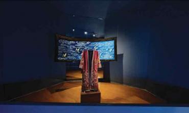
In Pakistan, a number of artists have been engaged in exploiting as well as promoting the qualities of colours through their work.
Some, like Askari Mian Irani, offered a taste of antique objects through his choice of tarnished turquoises, burnished browns, withered whites, omitted oranges, garish greens and battered blues.
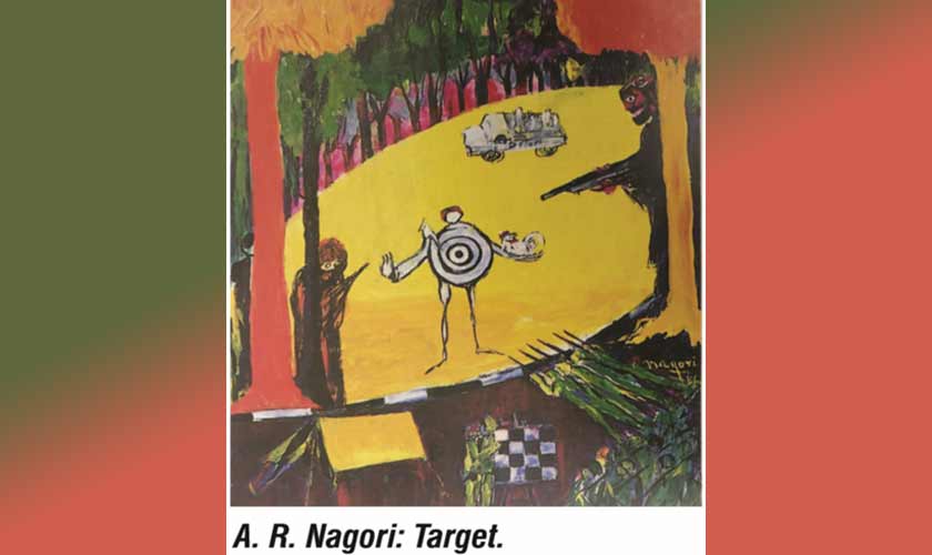
Others have employed colours for political purposes, for instance the work of AR Nagori.
However, for a majority of artists, colour is a vehicle either to carry intelligible forms, or emotionally charged marks/shapes, or a combination. Many subscribe to a dominant colour code.
If not connected to a symbol or emotion or divinity, the colour represents a physical object. Sunflowers are yellow, grass is green, sky is blue, letterboxes are red and the soil is brown. Thus a colour has to refer to an object, no matter what the context.
I had always believed in this physical bond — in contrast to symbolic suggestions — till I was invited to teach drawing to a class of three year olds. I asked the kids to draw the sun. A majority painted it in yellow and orange except for one who made it in green. I asked the child if he had ever seen a green sun. “In my house, the sun is green,” he informed me.
That day onwards I also started seeing the sun in green and in multiple other shades.