Print Story
X

Deconstructing the design of TNS Beaconhouse, Gulberg, which is “a very meticulously planned project”
| O |
One would think that a building as famous as the Guggenheim could have done a better job of space allocation around its spiral ascent. For today’s project, also taking a big spiral that twists its way to the atrium at the top, I take apart the spatial lingo that caters to its younger, more impressionable audience. To be fair, whether this spiral holds the more impressionable audience or the Guggenheim’s is a matter up for debate.

Using the Reggio Emilia approach towards education, The New School was conceptualised keeping in mind a hitherto unconventional mode of learning. I wonder if that is because the people who’ve come out of the more conventional teaching systems have turned out rather disappointing.
I do not aim to mock any method of learning. With mass schooling one of the biggest experiments to take place on the planet, it is only feasible that we plan and experiment with our findings on the way the children develop. TNS seems to have hit on a sweet spot here: the modes of learning incorporated into the structure quite literally work on the structural wiring of the children who can afford it.
The building design was a collaboration between Rosan Bosch Studio and Lahore-based Designs. It comes with its own set of programming: the floor levels identify which “grade” the student is in. They also nurture a mixed-age learning where concepts such as “watering-holes” and “campfires” denote the various methods of formal and informal education.
Aiming to implement problem- and project-based learning, however, the design required critically studying not only the international methodologies that were to be interpreted for the local environment, but also architectural customisation that would help children feel more at home. It’s a very meticulously planned project.
What stood out to me initially was the concept of a library arranged close to a high traffic area — books and shelves have always been segregated from active corridors and stairways. Yet it makes more sense for libraries to be placed in clear view. Spaces for quiet and/or group perusal have been designed a little farther away. Encouraging engagement means building more sensory connections with activities one wants to promote. These children will associate reading with all the pleasures a small cubby affords: kid-sized enclosures labelled as “caves” that give children the space for independent learning.
Here we see spaces where informal learning is recognised as a mode of development — places termed as “watering holes” to mimic the idea of a central intellectual hearth. The architecture fosters the concept of a village-based structure by introducing more flexible modes of learning.
These contiguous spaces hold meaningful concepts in each of the elements that make up the interior. For instance, the walls are not solely brick combinations. They allow expression and interactive learning; which child does not like climbing or drawing on them?
Built into an irregular shaped plot, the arrangement of these cozier than usual rooms promotes a more participatory learning experience. The “mountain top” concept forces a child to step out of their comfort zone in an environment they know will protect them should they fall. As small humans, they need the world around them to be small, too, which is why the furniture in the building was customised ergonomically. While the spaces have all been worked out to cater to their needs, I can’t help but observe the indoor-ness that the children of the future will have to live with.
The architect, Saad Khan, assures me that the school is going to make ample use of the sports facilities provided by the Punjab Sports Board right across the road from the campus. The school also makes full use of its square footage — there is a racing track on the roof. Besides, the upper levels of the building incorporate green areas to lessen the heavy solidity that such a campus can carry.
With commercial areas notorious for the high volume of vehicular traffic and the bad quality of air hence associated, it is always tricky designing more human-centric experiences, particularly when they involve children. The reality of it does invite speculation about urban planning authorities assigning zones and districts when planning the city.
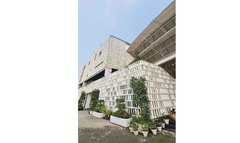
As for the exterior, an aluminum modular covering, the box-like screen, wraps itself around most of the structure. Dare I say the boxy-ness of the design reminds me of buildings from the 1970s, when people looked to architecture with hope for a progressive future? May this still be the way forward?
This cover acts both as the school’s aesthetic, and as a shading device. Coupled with the use of low e-glass, the building strives to provide a more sustainable solution to the increasing energy costs of running such a campus. Architecture will always have to be the bad guy when it comes to sustainability — the RCC framed structures will still be the enemy of the climate. That is not to say we cannot build without aggravating Mother Nature; there is just too many of us now.
The circular element dividing the regularity of the building also employs movable shading panels. With the aluminum cover making use of angled verticality, the windows are functionally recessed. A green space cuts through the building in one block, reducing the optical strain of the members which might otherwise begin to resemble an illusion. Although this contemporary form of clerestory recession is fashionable, it does hinder one’s view of the outside. You can’t win with everything, I guess.
The only real problem that stood out to me was the use of a dark ceiling colour. In the absence of conventional false ceiling for a more industrial look (and to offset the cost), the natural light that filters through the windows tends to lose some of its vibrancy on account of this darkness. While the clear height maintained throughout makes up for it, I did imagine a Louis Kahn-esque effect had there been a ceiling in place. Kimbell Art Museum meets TNS Smogville.
That is not to say the ceilings have not had their fair share of design. The linear beams that come together to form organic shapes on the ground floor ceiling seamlessly integrate into the metal railing that lines the central ramp. These organic shapes also seem to emanate from the ‘inspirational trees’ one sees growing out of the flooring. The industrial-ness of the design is not in-your-face and maintains a natural calmness with its bare, unfiltered vibe.
I believe that the architecture of the building should be applauded. While I cannot say what sort of individuals these children will grow into as adults, I am sure they’ll appreciate the amount of dedicated effort that went into creating such experiential, real-life learning.
The writer is the editor of The Anarchitect. She can be reached at theeditor @theanarchitect.com