Print Story
X

Artist Muzzumil Ruheel highlights the pictorial power of text in his works made with metal and paint
| “L |
et us imagine a world without language; and since I am going to insist that what we sometimes call the soul is simply the immediate source of any speech – the larynx of the logos – a world without words will be a soulless one as well.” Thus begins,the American literary critic William H Gass’s essay: Nature, Culture and Cosmos. Looking at the recent works of Muzzumil Ruheel, one could dissect his aesthetics through Gass’s ideas.
Ruheel, an artist trained in Lahore (BFA from the Beaconhouse National University) and based in Karachi has been interested in the appearance of things more than their meanings. Previously,he had used calligraphic marks (the artist in the past had some exposure to conventional calligraphy), old photographs and text to build his imagery, not unlike a number of his contemporaries who employ a similar sort of visualstrategy. Ruheel had enjoyed an impressive level of success with 17 solo exhibitions and projects to his credit. He has also participated in numerous biennales, art fairs, important group exhibitions, workshops and artists’ residencies.
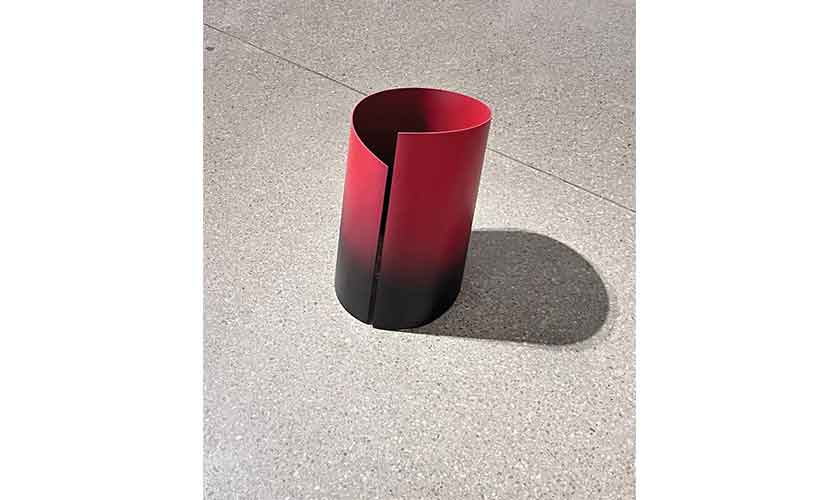
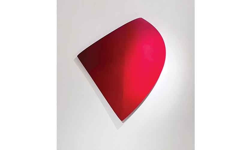
One residency that shaped his new works (part of his current solo show, Choose Your Words Carefully, January 10-19, Canvas Gallery, Karachi), was the third edition of Pioneer Artists Residency at Khushab in 2019. Organised in collaboration with Canvas Gallery, the residency at the Pioneer Cement Factory provided an opportunity for artists to work in any material, scale and technique. There, Ruheel produced a huge metal sculpture in red, the first character of Arabic alphabet, anchored deep in the earth. What a visitor saw at the factory was not the complete aleph, but a partly visible one emerging from the ground. Yet everyone was able to ‘read’ the partas the whole,the abstracted section as legible script. The experienceled the artist to further reduce the role of language.
Language has three components -script, sound and meaning - joined in an invisible and indispensable bond. Writers, who deal with text,are also aware of the formation of their words in its pictorial aspect and how these would sound. A senior journalist once told me that the veteran editor Saleem Asmi used to instruct his sub-editors to choose their newspaper headlinese, not only on the basis of content, but also considering the construction of letters in their visual appearance.
For a person alien to Arabic script, pieces of painted metal in various shapes, scales and dimensions could be exercises in abstraction. For others, these segments of letters, may allude to present day reduction of language, in the form of minimised text messages, emojis and acronyms.
The human eye seeks meaning in every object/act, which, otherwise,may be meaningless. Many of us spot sacred names on a freshly baked flat bread. For a large portion of the population,lineson our palm arethe extensive and definitive documents of our past and future;the course of stars determineshuman destiny;a black cat crossing one’s path is a sign of misfortune. A painter’s strokes and scrawls on a canvas occupy a critic to decode these non-figurative marks into intelligent ideas.
The twelfth century Persian poet, Anvari, says: “You are in the world and yet are greater than it/Like meaning in a text.”The entire question of meaning within text, or script is a crucial matter for writers and inscribers. Religious calligraphy, due to its exuberance,excellence and purity,aims to matchthe word of God. So a person, unable to read Arabic, still gets the holiness of the message by looking at the elegantly formed letters on a manuscript page. The link between visual manifestation andits content is illustrated in an anecdote quoted by the Belgium born-Australian based author, Simon Leys; relating to a famous Chinese painter/calligrapher of ancient period. Some villagers went to him and complainedabout a man-eating tiger. To ward off the beast and solve their problem, the painter wrote on a large banner: Tigers are not welcome here.
Thepictorial power of text is recognised by Muzzumil Ruheel in his works made with metal and paint.However, one can only speculateon the meaning behind these texts. Notthat what the separately manufactured characters of alphabet signify, but what the new art of Ruheel communicates. For a person alien to Arabic script, pieces of painted metal in various shapes, scales and dimensions could be exercises in abstraction. For others, these segments of letters, may allude to present day reduction of language, in the form of minimised text messages, emojis and acronyms. Simplifying letters, Ruheel excavates something new in the act of writing, especially the bend and turn in each form (probably possible due to his calligrapher past). When a pupil learns the art of calligraphy, he/she is introduced to the mathematical equation of inscribing a letter, shift in the direction of hand, the angle of pen the amount of ink in reed pen.
Muzzumil Ruheel, having memorised these lessons, moved beyond them. So for him aleph, is not the first letter of the alphabet, it is merely a shape. The scriptis a pictorial manifestation of language; which in any case transforms the tactile world into a system of signs. A chair means a specific piece of furniture, but in the hands of calligraphic-artist,its inscription contains a range of connotations.Simon Leys informs that for Chinese “the highest type of pictorial style is called xieyi, which means the style that writes the meaning of things (instead of describing their appearances or shapes).”
Ruheel, recognising the elementary nature of language – spoken, written, remembered, has picked minimal aspects of an inscribed content. In his exhibition,you come across shapes of letters or characters, cut, cropped, turned,that you may try to read. But no matter how hard you try to decipher them, this is not what the painter planned. He envisaged his viewers confronting a new language, with each new glance, side and position.
There have been multiple languages aiming at ‘readability’ (books) and ‘recognisability’ (like road signs). In Muzzumil Ruheel’s new sculptures, both tongues happen to be in the same cheek. He strips characters from their original forms to arrive at a different synthesis or metamorphosis. Actually, shapes recurring in his art are identified as letters before being appreciated as abstract forms. Ruheel has constructed calligraphy in metal and paint, a medium usually associated with viewing(sculpture) and not with reading(ink on paper) – although there is a great tradition of carving text in stone and marble in Islamic architecture.
The selective approach, impressive fabrication and remarkable precision in the representation of text-based imagery impress a viewer at Ruheel’s display, till he/she fumbles upon works like Character 19–Step Towards, Character 7 Option II–Long Story, and Character 12 – Round and Around, in which simple shapes of aleph, a circular move of mark (qat), are produced in metalin one colourbut end up with another hue -somehow a decorative device. A traditional calligrapher knows the tension, texture and sensuousness of the ink-loaded reed pen, with its receding amount of a single hueforone letter. A trait, and beauty that make a word speak to you, with varying texture ofink/voice.
When Ruheel tries the same tactic, adding more than one colour in some of his works,the text turns tactics and the voice becomes void.
The writer is an art critic based in Lahore